 Bojan
BojanYou know that ugly WordPress error screen? Yeah… you can replace it.
If you’ve ever built anything serious on WordPress – a SaaS, a dashboard, a customer portal – you’ve definitely seen that screen: White background. Basic serif text. “Error: Something went wrong.” Looks like Windows XP had a panic attack. It’s the fastest way to make a modern product feel 15 years old. Most people assume
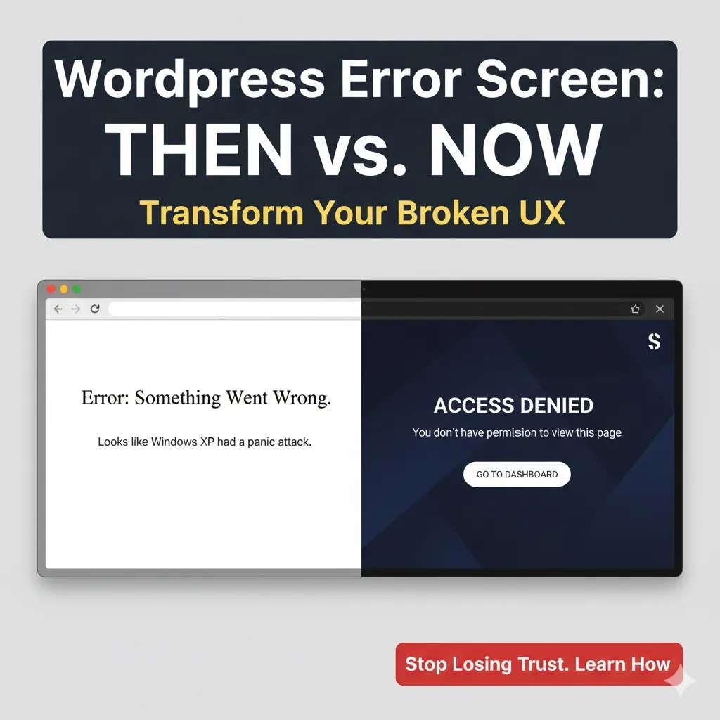
If you’ve ever built anything serious on WordPress – a SaaS, a dashboard, a customer portal – you’ve definitely seen that screen:
White background.
Basic serif text.
“Error: Something went wrong.”
Looks like Windows XP had a panic attack.
It’s the fastest way to make a modern product feel 15 years old.
Most people assume it can’t be changed.
But here’s the thing:
You can completely replace WordPress’s wp_die() screen with your own branded, modern, fully designed error experience.
And it changes everything.
Why this matters
Customers judge products in two moments:
- When things work beautifully
- When things break
WordPress’s default error screen destroys both:
- No branding
- No layout
- No dark mode
- No helpful actions
- No clear message
- No UX – just “Error.”
If you’re building anything above simple blogs, this screen breaks trust instantly.
So I replaced it.
What I built instead
My custom wp_die handler turns fatal errors into clean, polished screens that look like part of the app:
Tailwind UI
Dark mode support
Preloader animation
Clear titles like “Access Denied” or “Link Expired”
Friendly messages
Smart redirect buttons
Background shapes and gradients
Full brand feel
It looks like something from Stripe, Notion, or Linear – not… WordPress.
Like this:
- Permission issue? → “Access Denied” + link back to Dashboard
- Expired link? → “Link Expired – try again”
- Security check failed? → “Security Error”
Users understand exactly what happened and what to do.
Why this is so powerful
Because out of all features developers obsess over, almost nobody touches error UX.
But your error states are the most emotional moment in the entire product.
If the user sees:
a scary unbranded WordPress error → they blame your product
a clean, intentional message → they trust you handled it
It’s one of the highest-impact UI upgrades you can make.
Yes – you can implement this right now
This isn’t a hack.
It’s WordPress-native:
add_filter('wp_die_handler', function() {
    return 'sf_custom_wp_die_handler';
});
From there, your handler renders a full custom HTML page (Tailwind, Alpine, dark mode, whatever you want).
WordPress does the rest.
The result?
Your platform feels like a real product, not a CMS with plugins glued to it.
This is a small detail, but small details build trust – and trust keeps users inside your app.
Want the full code?
Check out the GitHub gist.