 Bojan
BojanDesigning the Ideal Sample Ordering Experience
Designing the Ideal Sample Ordering Experience In every packaging or label company, sample requests are part of daily life. They help sales teams win deals and give clients a tangible feel for quality.But in most companies, the process behind those samples is messy – scattered emails, missing details, and no clear way to track what’s
Designing the Ideal Sample Ordering Experience
In every packaging or label company, sample requests are part of daily life. They help sales teams win deals and give clients a tangible feel for quality.
But in most companies, the process behind those samples is messy – scattered emails, missing details, and no clear way to track what’s been sent.
When I started building SampleHQ, my goal wasn’t just to digitize the process. It was to design an experience that actually made life easier for everyone involved – from sales reps to fulfillment teams to managers.
Designing for the Real User
The first design decision was simple: no clutter, no learning curve.
Most people in manufacturing environments don’t want another “system.” They want something that works the first time they log in.
That meant focusing on clarity and flow, not fancy features.
Every screen in SampleHQ is built around a single goal – create, track, or fulfill a sample order – without unnecessary steps or hidden options.
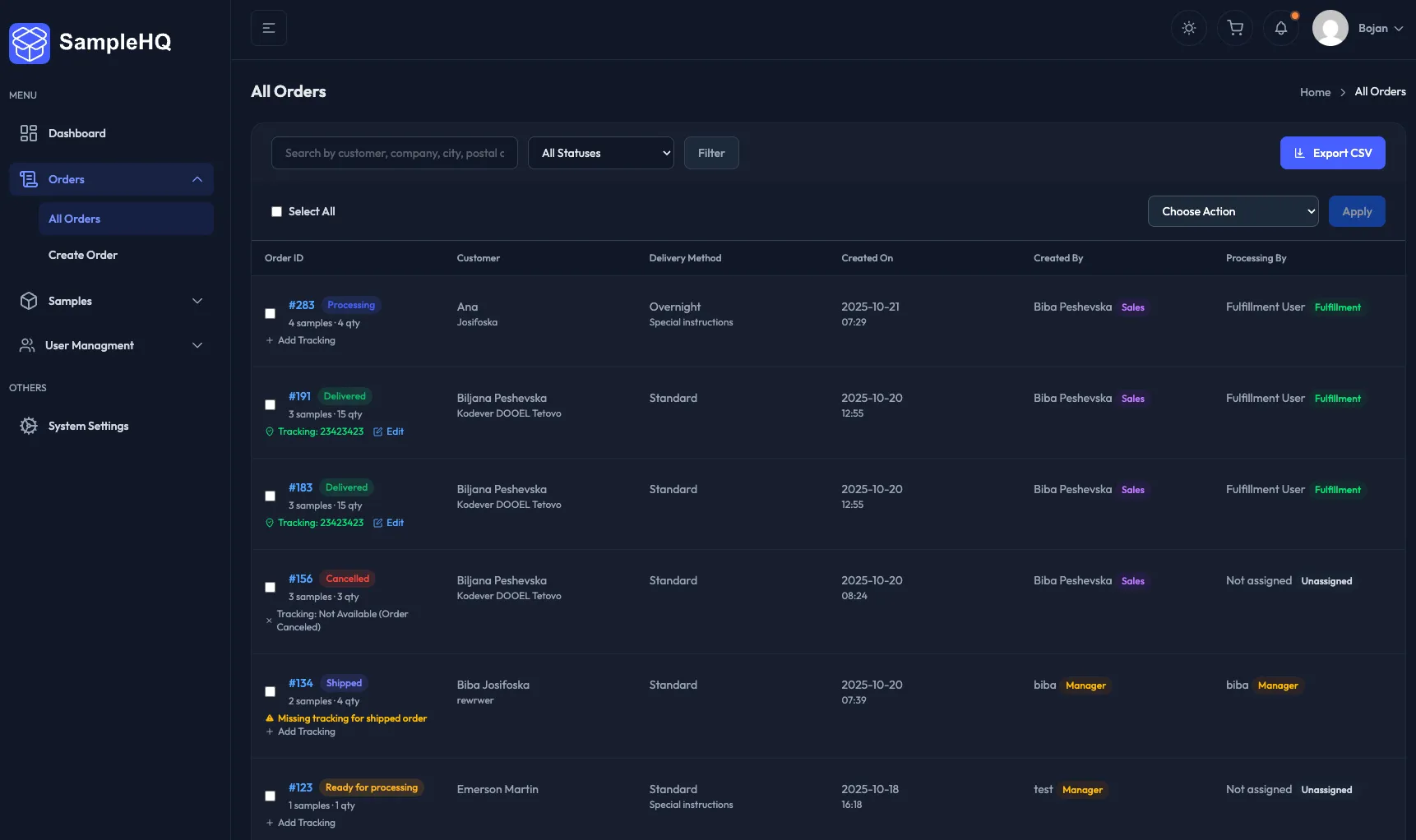
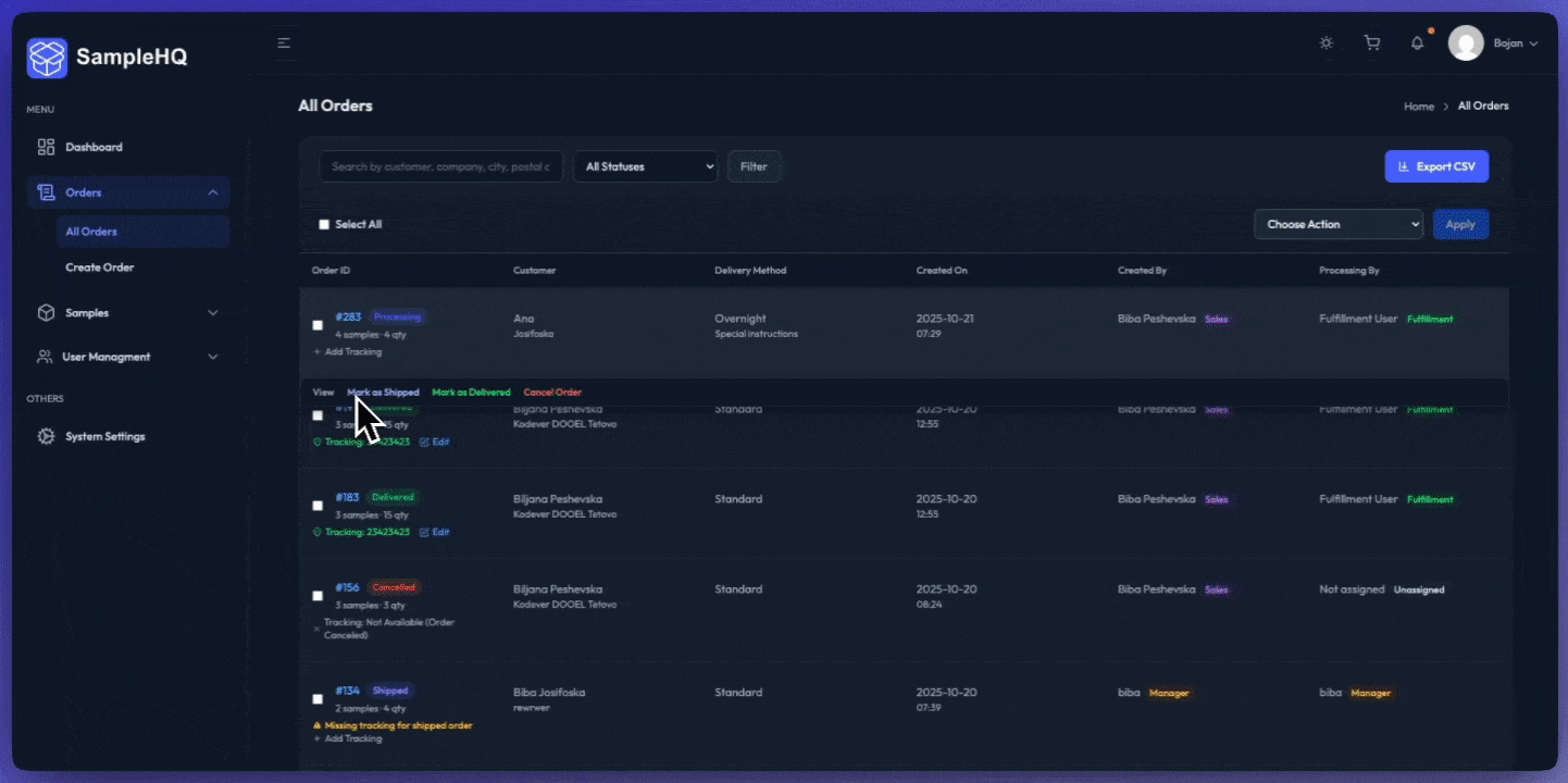
A Clear Workflow for Everyone
The entire experience revolves around three roles:
-
Sales Reps create requests by browsing a visual catalog of samples, selecting quantities, and adding recipient details.
-
Fulfillment Users see only approved requests, mark them as shipped, and add tracking information.
-
Managers can view everything – users, requests, and activity – from one dashboard.
By separating responsibilities this way, no one wastes time searching for what’s relevant. Each dashboard feels built specifically for that role.
A Visual Catalog That Feels Familiar
The Sample Catalog was designed to feel intuitive – card-based, searchable, and filterable by category, subcategory, and tags.
Each item includes an image, description, and quick-add button.
This small detail matters because it mirrors how sales reps actually think – visually. They remember what something looks like more than what it’s called.
From the catalog, adding to an order takes one click.
No forms hidden behind forms – just a direct, fast workflow.
Order Creation That Feels Effortless
Creating a sample order in SampleHQ takes less than a minute.
Users can:
-
Add multiple samples and quantities
-
Enter recipient and company details
-
Add a cover letter (from a saved template or custom note)
-
Submit for approval or directly to fulfillment
Every field, button, and notification has been tested for clarity. The goal is not to impress – it’s to remove friction.
Role-Based Dashboards
Each dashboard was designed for focus.
Sales reps see their requests grouped by status.
Fulfillment sees approved orders ready to process.
Managers get the full overview with filters for users, clients, and order states.
It’s a layout built around action – not reporting. Every button leads to something immediately useful.
Notifications That Keep Teams Aligned
Email notifications are built into every key event:
-
When a request is submitted
-
When it’s approved or rejected
-
When it ships with tracking details
This keeps everyone informed without needing to log in constantly.
In future updates, these notifications will also integrate with CRMs like HubSpot and Salesforce, ensuring no lead or sample goes unnoticed.
Clean Interface, Real Performance
The UI uses TailAdmin, a Tailwind-based framework that’s both light and consistent.
It loads fast even on factory Wi-Fi, and adapts perfectly to tablets or laptops used on the production floor.
Design decisions weren’t made for aesthetics alone – they were made for usability in real conditions.
What’s Next
The next phase focuses on analytics – helping managers see which samples lead to real sales and where requests get stuck.
From there, automation and AI suggestions will come into play – but only if they simplify the workflow, not complicate it.
Final Thoughts
Designing SampleHQ wasn’t about chasing trends or building something flashy.
It was about empathy – understanding how these teams work every day and creating a product that genuinely helps them do their jobs better.
If software feels effortless, it means the design did its job.
That’s the kind of experience I wanted SampleHQ to deliver – and it’s what every good tool should aim for.